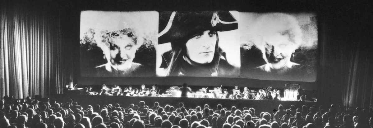
When I can’t decide on what to watch, I begin hunting my shelves for curiosities. Goodness knows, I have a lot of material to catch up with on DVD, let alone my hard drive. Faced with too much choice for a single feature, I fall back upon compilations of short films. At the weekend, my eye fell upon the spine of I colori ritrovati: Kinemacolor and other magic, a 2xDVD set released by the Cineteca di Bologna in 2017. I realized shamefacedly that I had never sat down and watched the contents from start to finish. At something of a loose end, feeling indecisive and uncommitted, I sat down and watched. For the next three hours, I was transfixed.

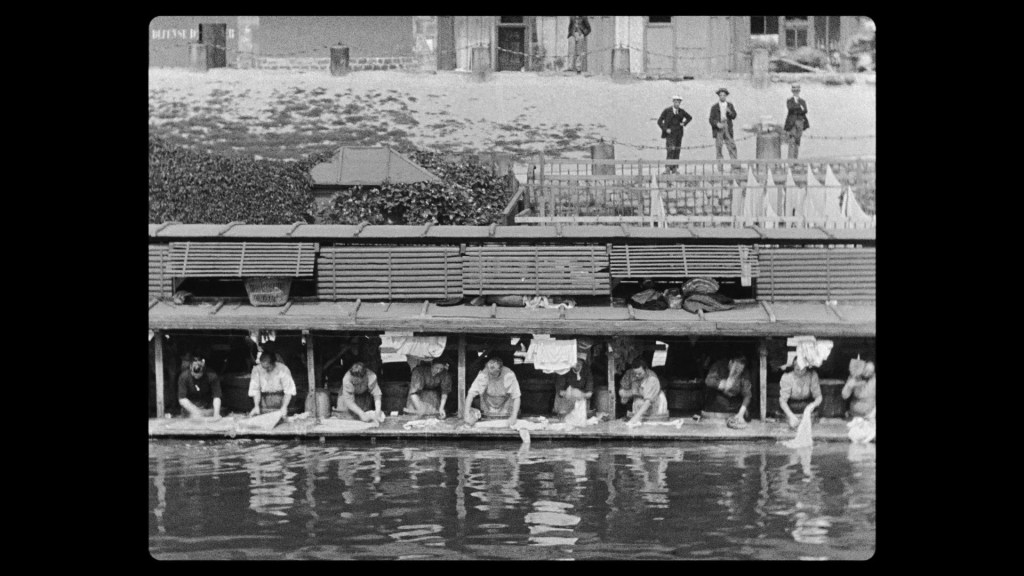
I colori ritrovati contains four curated programmes of films. Each programme contains a selection of short films made through an early colour process: Kinemacolor Urban, Kinemacolor Comerio, Chronochrome Gaumont, and Pathécolor. The films were produced between c.1907 and 1922, and range from 50-second fragments to 12-minute works of substance. Most offer “views” of touristic locations or noteworthy occasions, while the shortest films often concentrate on attractive objects which happen to make good subjects for colour. The content is what Tom Gunning et al. have described as “the cinema of attractions”. This definition usually implies either a kind of non-narrative model, or else a model in which the visual content or novelty of the film outweighs the importance or depth of narrative. The films of I colori ritrovati certainly fit this broad characterization, but there is a lot more to their pleasures than this definition of “attractions” might imply. Below, I discuss each programme in turn per their presentation on these DVDs…
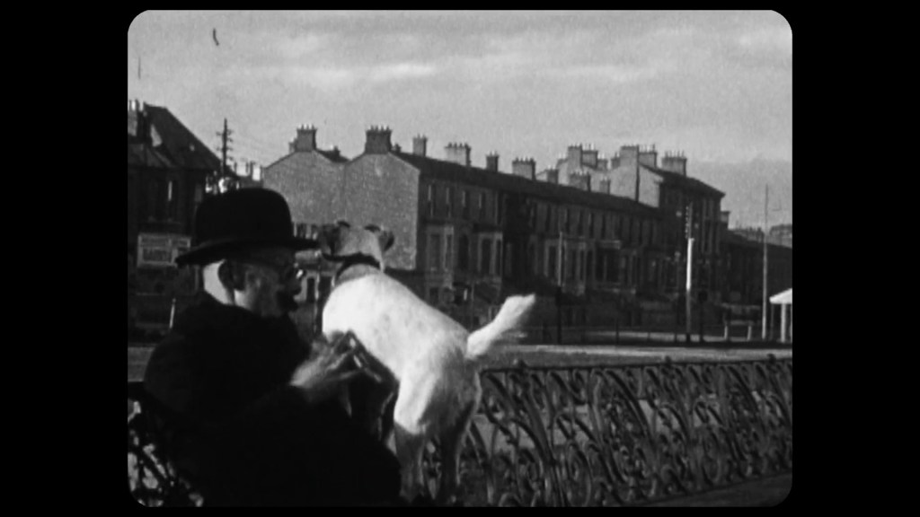
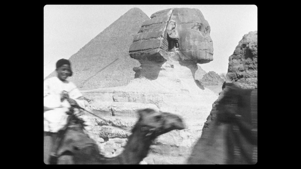
“Kinemacolor Urban” (ten films, c.1907-12). This first programme of films made under the aegis of American producer Charles Urban, based on the pioneering work of British filmmaker George Albert Smith. This process involved treating black-and-white filmstock to make it sensitive to red wavelengths. Shooting at 32fps (double the standard speed of filming), the camera captured alternate frames through green and red filters on its revolving shutter. Though the print produced was still black-and-white, when projected through the same red and green filters, the film miraculously burst into colour on screen. A century later, viewers are faced with the impossibility of replicating this kind of technology to project the films as intended. Digital restoration can separate the alternate frames exposed to green/red, apply the appropriate filter (i.e. alter the colour tone) and reunite the frames in a way that mimics the effect of the original projection. But it remains a conjectural approximation, via totally different technological means, of the original Kinemacolor process. What we see on our screens at home is but a digital reimagination of the colours of a century ago.
That said, the effect on this DVD is amazing. The palette has an invitingly warm, pastel tone – exacerbated by the summery, daylit scenes of so many of the films. But it’s all delightfully dreamy. The colours are not exactly faded, but lustrous according to an unfamiliar design. While the overall impression is one of hazy warmth, this allows certain objects to stand out with particular brilliance. The shores and slopes and distant mountains in Lake Garda, Italy (1910) have the tired, wintry hue of a slightly murky afternoon. The water is deep blue-green, but when its dark ripples give way to calm the surface is a wash of light. The silhouette of a sailboat floats serenely over the dazzle of the distant past. Crowds await us, staring as we glide towards the shore. A woman with a red parasol appears on deck. We see her again once she has disembarked. She turns to stare at the camera, the ship departing behind her. Perhaps she is waiting for a signal from the camera operator to move, or to stop. It’s so charmingly awkward, so eye-catchingly strange.


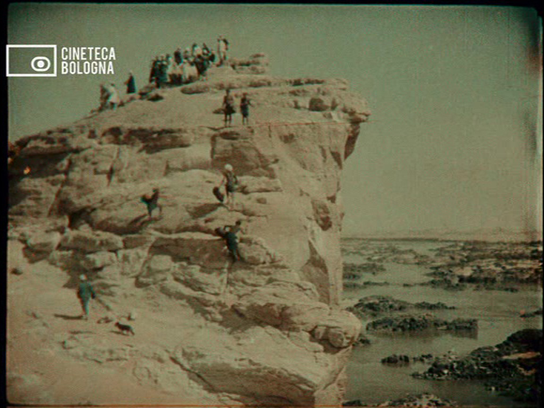
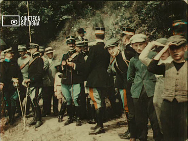
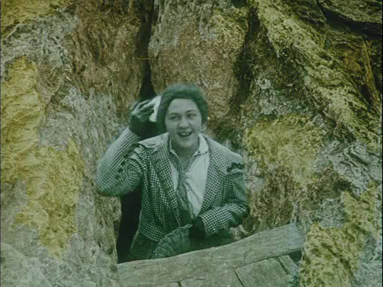
In other films, the effect of the ever-so-slight temporal disjunction between the two colours on successive frames gives the faint impression of stereoscopy. There is a kind of gap in space and time that the eye catches, or thinks it catches. When we see men on horseback, or figures silhouetted against the land or sky – suddenly their form seems to possess some magical depth. It is all illusion, of course, but that does not lessen the effect. The oddness and awkwardness of the content of films like Coronation Drill at Reedham Orphanage (1911), Nubia, Wadi Halfa and the Second Cataract (1911), With Our King and Queen Through India: The Pageant Procession (1912), and [Woman Draped in Patterned Handkerchiefs] (c.1907), and [Tartans of the Scottish Clans] (c.1907) is made touchingly potent by their form.
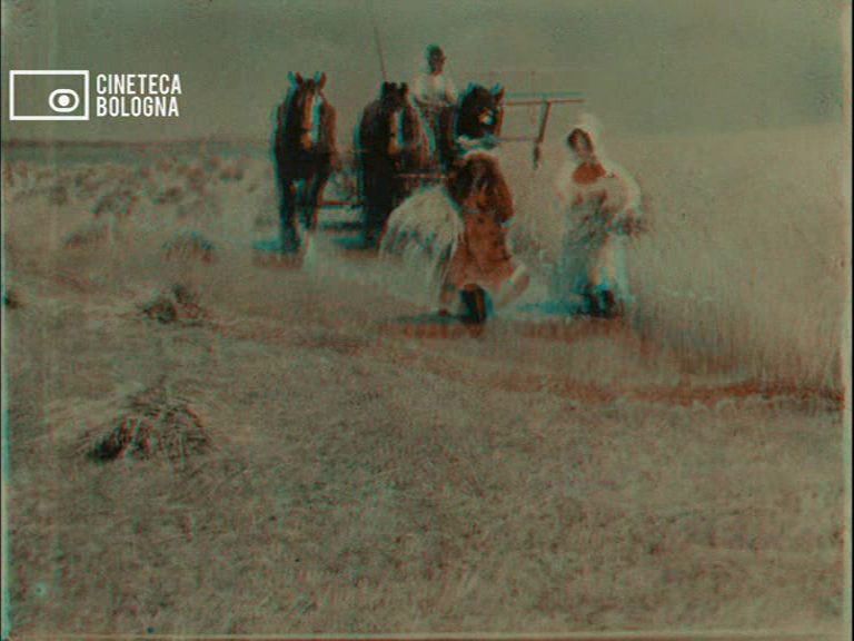


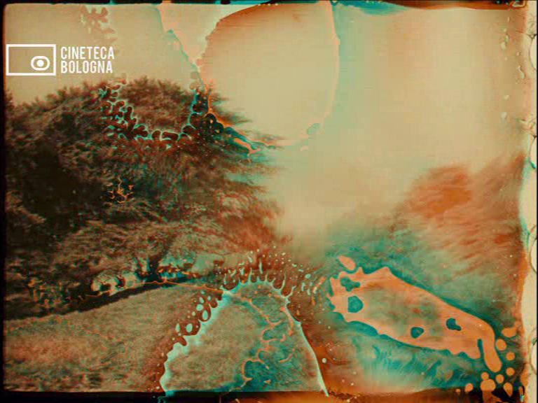
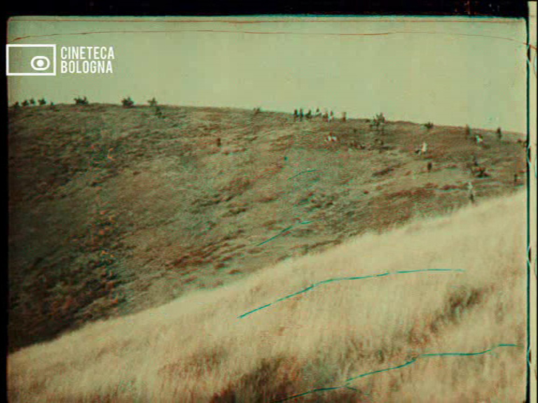
I was far more entranced by the landscapes in films like The Harvest (1908) and A Run with the Exmoor Staghounds (1911), and this entrancement was heightened by the anomalies of the Kinemacolor prints. In the Exmoor hunt, the riders and their hounds are themselves pursued by alien blotches of turquoise and scarlet. These colours are those of Verdigris and faded bloodstains, as though evidence of ageing in entirely different materials were manifest. Here were English landscapes so familiar to me made suddenly mysterious by tears, blurs, marbling. The silent trees and grass are tugged by lines of chemical decay that scurry across the frame, or else softened and blurred by the thumbprints of watery giants. The past is already so far from us in these films. Their silence is akin to death; their colours faded like memory. But the moments of disruption, when time literally seems to be gnawing at the image, make this past seem all the more fragile, potent. History unfolds before us, harried by its own disintegration. At the end of A Run with the Exmoor Staghounds, the film dares show us the dying stag; but as if to counteract this image of death, we are shown a brood of puppies suckling from their mother. It is life and death, awkwardly presented to us in a film that has itself only just survived.


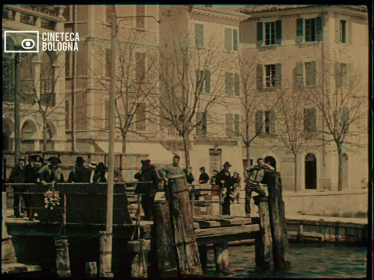
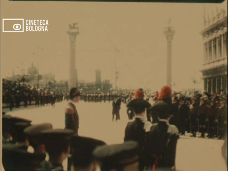
“Kinemacolor Comerio”(four films, c.1912). Italian producer Luca Comerio licensed the Kinemacolor process in 1912, so this programme is a small selection of the films made by Italian crews. There are glimpses of troops in Italy’s latest colonial enterprise in Libya, and the tragically earnest efforts of horses and riders crossing a river closer to home. But the most substantial film is L’inaugurazione del campanile di San Marco (1912), the Venice setting of which is beautiful for all the reasons I have outlined with the earlier films. There is the colour palette of the centuries-old facades, the somnolent waters, the hazy skies, and the charming pageantry of a previous century. Figures crane into the frame in awkward close-up, or rush to gather on some distant viewing point in the hope of being captured on film. A brass band stands around awkwardly waiting for their call to perform. Bishops trudge past. Plumes, flags, boaters. Archaic warships proudly anchored by the quay. Motorboats and gondolas. It is the Venice of Proust, of D’Annunzio, of Henry James, of Thomas Mann – and just about any other fin-de-siècle figure one cares to think of. The hue and haze are akin to the contemporary Autochrome still photographs produced by Lumière. The details are softening, the colours made pastel. Yet there are those familiar flashes of intense red, of deep blue-green, and the darkness of formal suits and top hats raised aloft in assurance of the coming century.


“Chronochrome Gaumont” (nine film fragments, c.1912-13). The second DVD begins with a programme of fragments from surviving Chronochrome films. As the excellent liner notes details, Chronochrome was an additive system involving three lenses on the camera to record simultaneously three images through three colour filters. During projection, three lenses were likewise used to (re)combine the three images into one. The difficulty (and constant adjustment) of filming this way necessitated a reduced frame height, giving the resulting films a widescreen effect. The results are simply stunning: these are by far the most successful, vivid, and absorbing colour worlds on these DVDs.
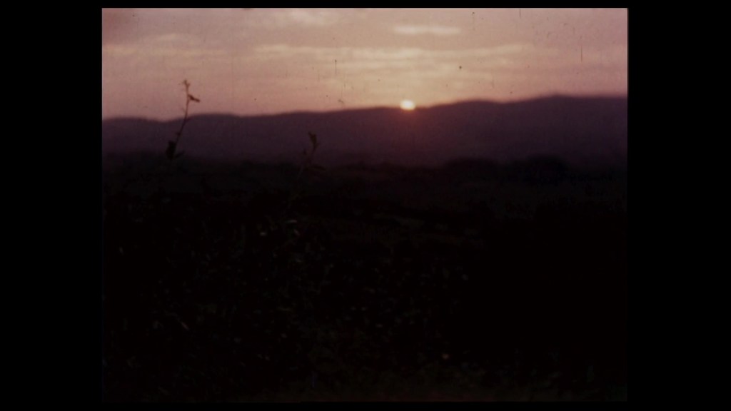
If I thought of Proust with the Kinemachrome film in Venice, here is another landscape from À la recherche du temps perdu. At Deauville-Trouville, children in dark bathing costumes play in the breaking waves. Adults mingle by red-and-white striped tents. (It is a vision of Proust’s Balbec. The images’ silence surely admits some dreamlike realization of an imagined time and place.) In View of Enghien-les-Bains, crowds of impeccable tourists wander under the boughs of trees whose green is like none that exists in our world, in our time. So too the mountains and sky, the curious cattle, the smocked peasants, and the bare trees of Provence: The Old Village of Annot possess a kind of echt French pastness. The landscape is once again wintry but bright. The scrubby roadside, the faded trees, the dusty road, the empty fields – aren’t these archetypes of an imagined countryside? They are prosaic and extraordinary at once. So it is with Picturesque Greece and Venice, Queen of the Adriatic, and in Chioggia, a Fishing Port Near Venice. They are hauntingly real, yet infinitely distant.


Aesthetically, one has the same impression with the tableaux of still lives: Venetian Glass-Ware, Flowers, and Fruits. These are set on a slowly rotating table, and the camera simply observes these hypnotic turns of glowing glass and fruit. These objects are incredibly real: and I emphasize equally incredible and real. They are palpably there before us, weighty lumps of glass, heavy bowls of fruit, potent buds of flowers; their colours and textures and contours are saturated by reality. Yet the saturation of colour, the way the glass glows, the way even fruit seems to assert its presence on screen – these aesthetic aspects are more than real, they are supernal, almost supernatural. I have never seen a pile of oranges so lustrously tempting. Like the shots of Venice a century ago, this fruit is here so madly, vividly, aggressively alive that it is hard to comprehend that it cannot have survived more than a few days, even hours, after being filmed at the start of the twentieth century. So too the Venetian glass bowls seem not merely to be bright and colourful, i.e. to possess brightness and colour, but to emit brightness and colour. The greens and purples look radioactive, dangerous – as though the glass were transmitting its colour, its very quiddity, across the centuries.


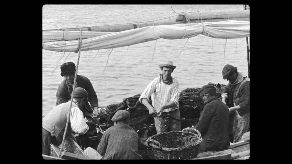
“Pathécolor” (fourteen films, 1905-1922). The final programme on these DVDs returns us to the most successful early producer of colour films. Pathé’s “pochoir” process involved laboriously cutting stencils for each colour for each frame of film. Once this was done, the stencils could be used to mechanically stamp dye onto the frames. Though time-consuming to cut each stencil, these stencils could then be used to colour multiple prints of the same film – a great boon to mass production. Combined with tinting and toning, the effects of this process could be extremely varied and complex. I have already discussed this process in relation to fiction films like Casanova (1927), but this programme presents a series of short films almost exclusively within the touristic/documentary mode.
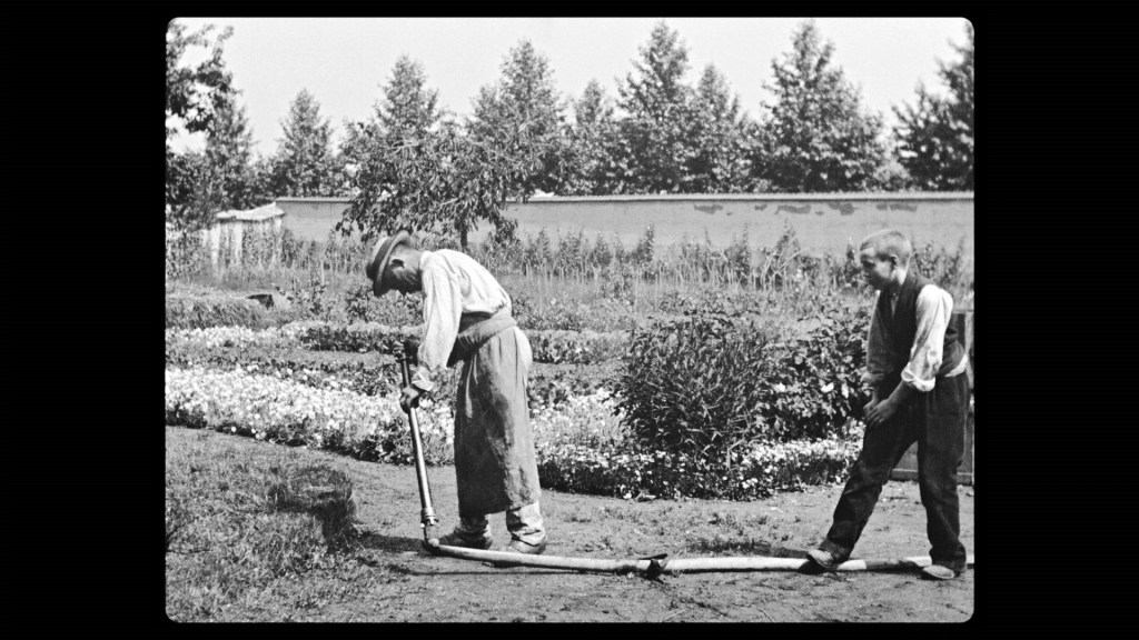
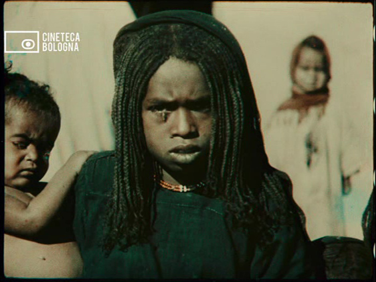
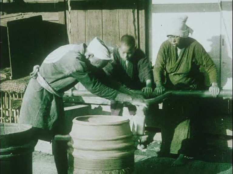
Appropriately for the machine-tooled Pathécolor, several films are devoted to various combinations of handmade and industrial processes. And just as the work of cutting Pathécolor stencils was primarily undertaken by women, so in Industrie des éventails au Japon (c.1914-1918) we see Japanese women laboriously cutting, colouring, and folding fans. In La Récolte du riz au Japon (1910) whole families and all ages are engaged in the elaborate harvesting and preparation of rice. This kind of narrative is at its most elaborate in Le Thè: culture, récolte et préparation industrielle (1909), where we watch the whole process of cultivating, harvesting, refining, and preparing tea – even to the point of watching it being served and drunk. This film even offers a kind of dissection of colonial industrialism: from the poor indigenous labourers in the fields and the white foremen overlooking the subsequent preparation, through to the middle-class white women being served tea by their Indian servants. La Chasse à la panthère (1909) offers another glimpse of class and race in the gruesome business of a hunt. (The white man carries a rifle and stands triumphantly over the trapped beast, while his native servants do all the dirty work, then the carrying and lifting.) There is an odd disjunction between the fantastical application of colour and the matter-of-factness in the way the film shows us a panther being tortured, beaten, shot, and skinned.


The drama of transformation is more surreal in La Chenille de la carotte (1911), where caterpillars in garish colours metamorphosize into butterflies. Here, the colour makes these extreme close-ups of writhing insects purely terrifying – I can imagine this film being overwhelming on a large screen. so too with the time-lapse photography of Les Floraisons (1912), where flowers writhe into organic fireworks – and writhe through the additional layers of colour laid on by Pathé.


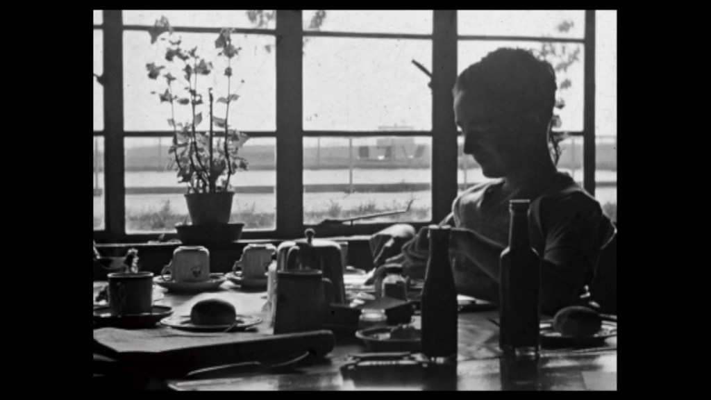
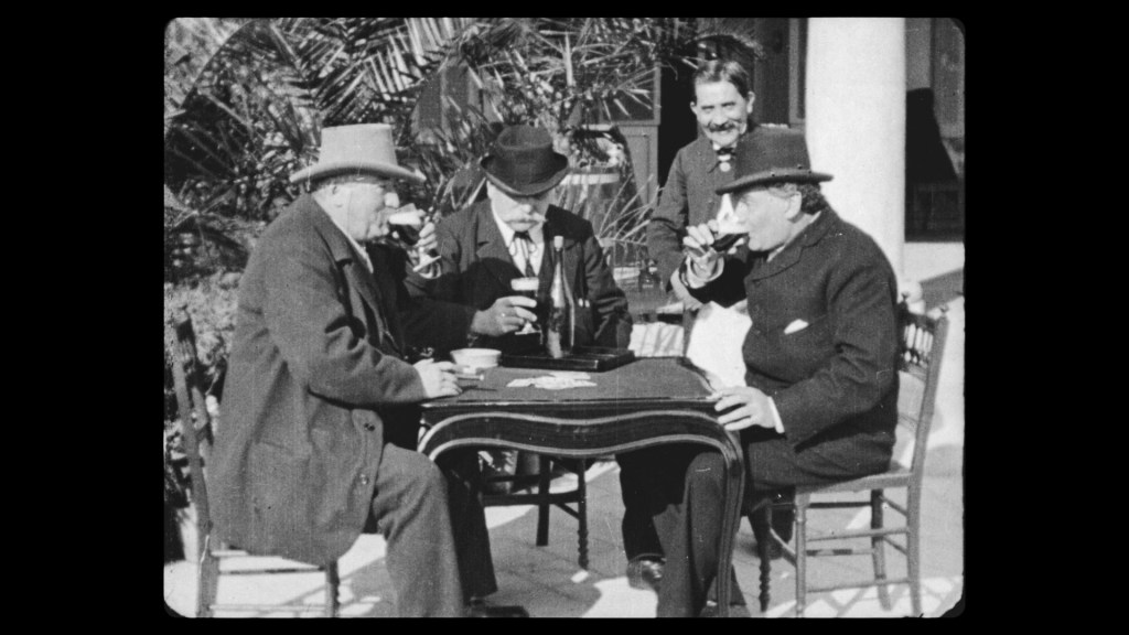
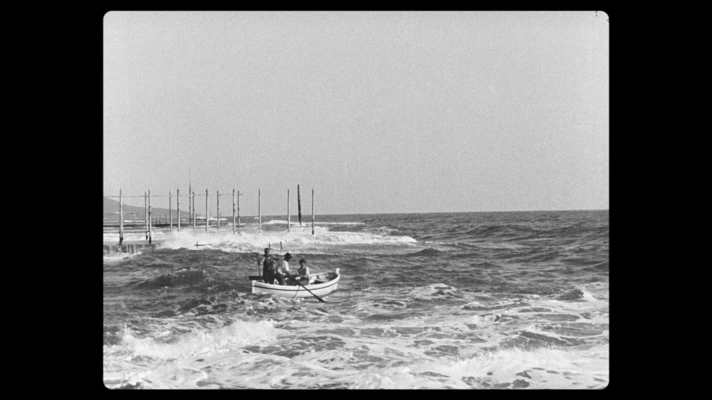
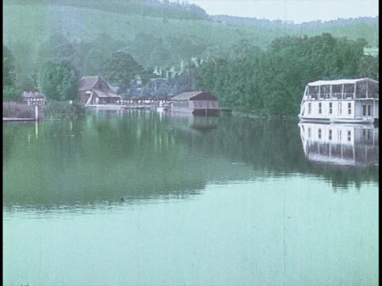
Calm is provided by the travelogue pieces, from the gentle rhythm of Barcelone, principale ville de la Catalogne (1912), seen primarily from the vantage point of a slow-moving boat, to the even more languorous rhythm of Les Bords de la Tamise d’Oxford à Windsor (1914) – a slow cruise down the river, past exemplarily English riverbanks, locks, lawns, pleasure boats… and all in 1914, when one senses that the meaning of this world and its inhabitants would undergo some irreparable change.


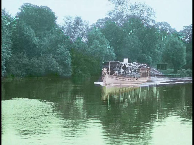


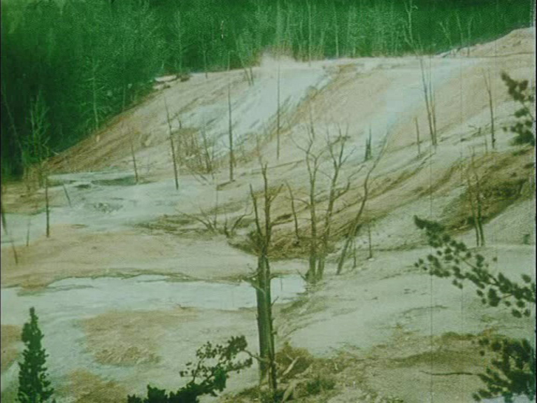
More exotic locales are found in La Grande fète hindoue du Massy-Magum (1913) and Le Parc National de Yellowstone (1917). I confess that during some of these films my mind began to wander. The application of colour over the film image often flattens rather than deepens our perception of the views being presented. For example, I would much rather have seen the journey along the Thames in monochrome. The broad application of single colours – green, green, and more green – does little to enhance such a landscape. Tinting or toning would surely be preferable for this kind of combination of open river, spacious meadow, and large sky. Other such travelogue subjects become postcard banalities. For all their delight and novelty, there is a stiltedness in the colour that dulls their power. But perhaps this is just the result of these Pathécolor films being at the end of the second disc and me growing tired?


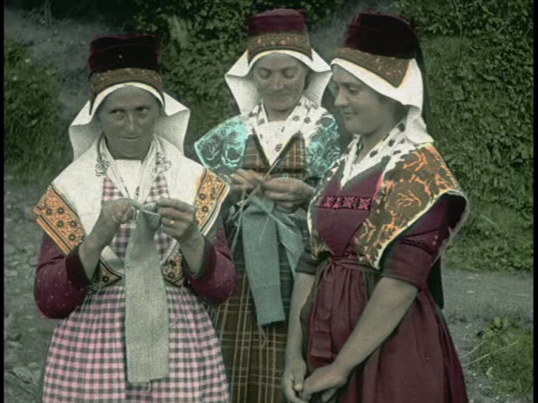
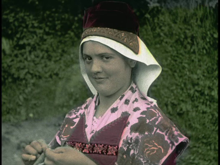
It is a relief to glimpse more human aspects in these films. In L’Ariège pittoresque (1922), views of mountains and houses are followed by awkward glimpses of locals in traditional costume, posed stiffly for the camera. Here, and in Coiffures et types de Hollande (1910), there is the delightful tension between the awkwardness of the pose of the locals and the delightful glimpses they give towards the camera operator – and to us. These long-dead faces are at their most alive when they try not to grin, when they cast a glance of annoyance or bemused patience at those who stare at them – then and now. Perhaps to reassert the neatness of fiction, the last of this programme, La Fée aux fleurs (1905), returns us to a typical kind of “attraction”: an excuse to decorate the frame with greenery and flowers, and to have a woman with a beaming smile gaze approvingly out from the image, inviting and happy to live within her magical fiction.


As must be clear by now, I was very glad to have (re)found these DVDs and watched them all the way through. Their hypnotic power – somewhere on the borders of the distant past, somewhere on the borders of photographic reality – makes I colori ritrovati an absolute treasure trove of pleasures. The four programmes offer a variety of processes and subjects, from the real to the surreal, from the everyday to the fantastic, from the placid to the cruel. It’s a good reminder about the variety of colour technologies and the results of rival processes, all operating in the same window of film history – and across a variety of genres or modes of presentation. The DVD liner notes are superb, as one would expect from an archive-based release, and provide information about the history, preservation, and restoration of the films. (There are also restoration features on the disc, too.)
If I have a reservation, or at least a regret, about the visual presentation of this material, it is the presence of copyright logos throughout the programmes of Kinemacolor and Chronochrome films. The former has a “Cineteca di Bologna” logo in the top left, the latter a “Gaumont” logo. The DVD liner notes mention that there are strict copyright restrictions on the Chronochrome films. Not only does this mean that no complete film is presented here, but also that a remarkably ugly Gaumont copyright notice is stamped in the corner. I could get used to the Bologna logo in the first programme of this set (it is a simple and relatively discreet design), but the Gaumont logo is horrific: as ugly an intrusion as you could imagine. Atop the beautiful and subtle and rich texture of the Chronochrome images, this flat digital shape in the corner looked like a lump of birdshit had landed on the screen. I understand this material is unique and protected by goodness knows what level of copyright and archival restriction, but it seems a great shame to so spoil the astonishing visual impact of these films.
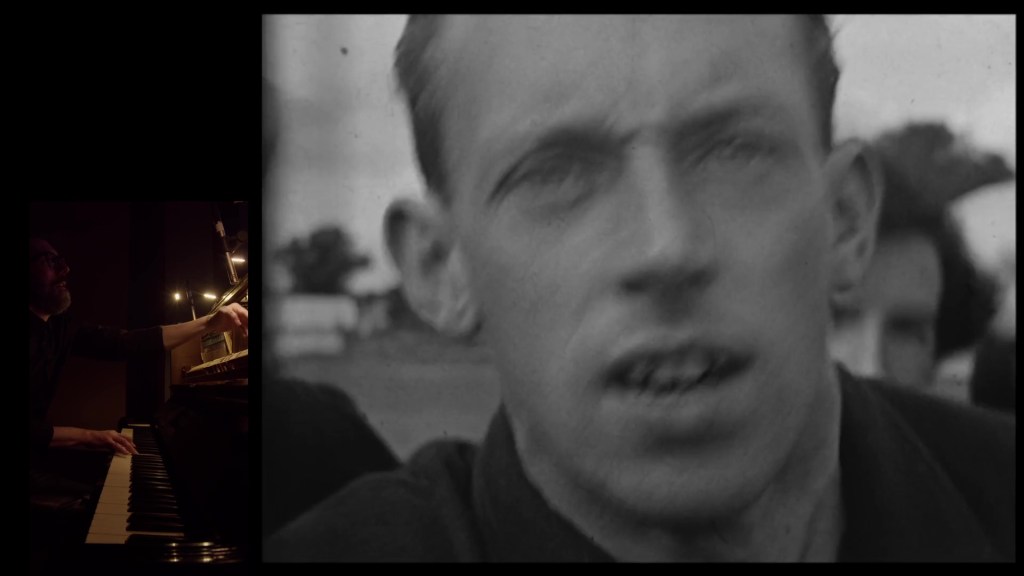
To return to the positives, I must also praise the music on these DVDs, which is provided on the piano by Daniele Furlati. I am often indifferent to piano scores but listening to these performances were much more pleasurable than I usually find. Firstly, I think the (relative) lack of narrative puts less pressure on the musician to be led by specific cues. The result is a more relaxed, impressionistic approach. I find Furlati’s music for these films both more melodic and more effective over longer timespans. He’s not chasing after the action or killing time waiting for a particular cue or change of scene. I was rather reminded of some of Liszt’s musical sketches inspired by/written on his travels around Europe in the 1830s. His Album d’un voyageur (1835-38) prefigures his more polished, thematized collection Années de pèlerinage (1842). Melodies take their time to develop, and there is a pleasingly rambling, reflective nature to the structure. This is travel music, capturing the slow speed of voyaging and the pleasure of stopping to gaze at views and absorb the atmosphere. With Furlati’s music for I colori ritrovati, I had the same impression of a relaxed, melodic meandering through these slow travelogues and touristic views. And, as Liszt sometimes quotes and develops local/national melodies into his work, so does Furlati. There is a lovely moment at the end of L’inaugurazione del campanile di San Marco (discussed above) when Furlati quotes a phrase from the Italian national anthem. He does so very subtly, and the tempo is so slow it’s like a memory of travel, of a place, of a country we’ve visited. The images it accompanies are of the nighttime façade of a palace in Venice. It’s a dreamy, melancholic, touching moment – a summoning of memory at the very moment the film ends, and the past disappears. Perfect.
Paul Cuff